Showing posts with label Fleer. Show all posts

Friday, September 20, 2013

Extremely Dumb And Incredibly Stupid

As I wrap up my current job and prepare for a new challenge, it's time to clean up some odds and ends I've had laying around my office and environs.


When I was editing coin magazines in Iola – no, wait; let me back up and mention how I wound up editing coin magazines in Iola.

I had been working for an ad agency in Wausau, Wis., that one day decided, Baltimore Colts-style, to move 200 miles south to Milwaukee and not tell me. I came to work one day and there was a sign on the door reading, “Moved to Milwaukee. Sorry.” Moved to Milwaukee? Really? After I created “The Wausau Center Mall Polka”[1] just for them? That’s gratitude.
After the unemployment ran out I was like Alexander the Great, weeping because there were no more worlds to conquer, advertising-wise. I really wanted to work for Krause Publications in Iola, Wis., because KP was local and did magazines about baseball cards. So I pestered the heck out of the HR guy until I got an interview for an editorial-assistant position on World Coin News – not Baseball Cards magazine by any stretch, but the proverbial foot in the door.
During the interview, and sometime before he told me the starting salary was 14[2], the HR guy asked me, “Do you collect coins?”
“Of course,” I said. I didn’t tell him my coin collection consisted of a half-full penny folder and a Band-Aid box full of dinged-up silver dollars, worn-flat Liberty quarters, Canadian beaver-back nickels, and a couple of bus tokens worth a total of $17.50.
That was the clincher. I was officially on the staff of World Coin News, and not too many months later, when the editor received a higher calling, I was named editor of World Coin News.

It was a position of not insignificant prestige in the numismatic community, because it attracted weirdos like Mountain Dew attracts hornets.

My favorite was The Mighty Shane Vickers. I’m guessing that was his full name, like Neil Patrick Harris, because whenever he wrote he never called himself anything other than The Mighty Shane Vickers.
Anyway, The (as I was fond of calling him in those days) once wrote me and demanded that his face be put on a coin emblazoned with the legend “I AM THE MIGHTY SHANE VICKERS,” and the coin shown throughout the national nightly news broadcasts of ABC, CBS, and NBC.
I don’t know what he thought I could do about it, and I don’t remember what terrible calamity he promised if his request was not carried out. It may have been something like, “Grant my wish or I will star in a Wonderful Pistachios ad.”

Naturally, we turned over The Mighty Shane Vickers to the authorities, who later made him Secretary of the Interior under George W. Bush.

The point of this autobiographical rambling is that The Mighty Shane Vickers was the victim of bad timing. If he could have waited another 10 years and learned to hit left-handed he could have had his face on a coin, and he wouldn’t have had to enlist some schlubby $14,000-a-year man to make it happen. Pinnacle would have done it for him. He still wouldn’t have been any closer to Peter Jennings, though.


I haven’t been to the National Sports Collectors Convention in more than 15 years, but I’m guessing that a card company still sponsors the exhibitor badges.
I look at this one and see two things: a stable of great SkyBox brands driven into the ground by the phine pholks at Phleer in Philly, and Tom Goodwin.

I’m not sure what message is being sent by putting Tom Goodwin on my exhibitor’s badge. It either means I’m extremely good at being extremely fast, or that I’m a one-time hot prospect reduced to being a one-dimensional role player most skilled at riding the pine.
I’m going with the first explanation, though the second one is certainly in play.


There’s a genre of cards from the ‘30s that show pulpy art of pulpy subjects. The most famous of these sets, G-Men and Horrors of War, look like grade-school comic-book pictures of Chinese babies having their heads blown off, printed on the inside of a cereal box and cut out with scissors. If Topps put Lamb of God in charge of its non-sport division and hired Shane McGowan to do quality control, this is the outcome you’d expect.
The guess is that Dart Flipcards was striving for that look with its Vietnam War set, but made the mistake of opting for quality and restraint over death-metal bands and toothless drunkards. The white cardstock (not a good thing in this case) shows every detail of the overly sketchy artwork (not a good thing, volume two). The card copy is bilingual but Canadian-polite in both languages (not a good thing/pas une bonne chose). The overall look is distinctive but not good-distinctive. More like homemade-distinctive.
No one wants to open a pack of cards and see a crude rendition of a burning child running naked down a Vietnamese road, unless that’s what the subject matter demands. The Rape of Nanking was a brutal, despicable act that demanded a brutal, borderline-despicable card. Similarly, the crime-doesn't-pay message had to be hammered home in the '30s, because there was a growing body of evidence that crime paid a whole lot better than unemployment.
Dart opted to come down on the side of tact. The result isn't bad; it's merely wrong.

More from the going-away (you wish) files next time.


[1] Truly a fine piece of creative work, if I say so myself. Wausau was making a Great Leap Forward with the construction of a downtown mall, and the city had hired our advertising agency to do the creative. One day my boss walked into our spacious-yet-dingy office above the King’s Knight discotheque in west-central Wausau (or WesCen, as all the cool folks called it) and said, “We need a mall jingle.” I went home and with my guitar and keyboard created a paean to the revolutionary shopping experience that was the Wausau Center Mall, and set it to the tune of “The Laughing Polka.” (Don’t ask me why I knew “The Laughing Polka.” If you spent any time in central Wisconsin in the ‘70s and ‘80s, you knew polkas.) I can remember one of the verses went,  “Oh when I was a little boy so many years ago/I used to love my shopping, and shopping wasn’t slow/But now I have a place to go that’s just like way back when/I shop the Wausau Center Mall, where shopping’s fun again,” and was followed by a chorus of, “Oh ha ha ha ha ha ha ha ha ha ha ha ha ha ha ha ha ha ha ha ha ha ha ha ha ha” etc. (They didn’t call it “The Laughing Polka” for nothing.) With this piece of sterling songcraft in hand I went back to work, walked into my boss’ office, and said, “I’ve got it – the perfect jingle. It fits the demographic, it works in the slogan, and it’s catchy.” Then I played her the jingle. It probably took them a week after that to get everything packed up and moved to Milwaukee.


[2] Thousand dollars a year, not dollars an hour. That distinction tripped up my buddy Phil LaFranka, who wound up taking a pay cut to come to KP, but I always thought the HR guy was not entirely to blame in Phil’s case. There’s no way Phil could have driven into Iola, Wis., population 925, past the millpond and the JBJ Store and the abandoned pickle factory and say, “Yeah, there’s a place here that’s gonna pay me 14 dollars an hour to strip ads into shoppers.”

Wednesday, June 26, 2013

The Art of the Sheet

Advertising is becoming more vulgar, in case you hadn't noticed. K mart wasn't even attracting spiders to its stores until it rolled out a video called "Ship My Pants"; now I have it on good authority that spiders flock to K marts, and occasionally even bring their own fly guys. K mart followed up this Citizen Kane of quasi-vulgar, semi-viral disgusting-discount-store videos with another called "Big Gas Savings." So if K mart were writing this blog, the title of this post would just be the tip of the mushy brown iceberg. But since K mart has absolutely nothing to do with this blog aside from providing 85.2 million Topps Collectors' Edition boxed sets as lovely parting gifts, we return you to our regularly scheduled post.


I was checking out a rival blog at the behest of my buddy Sparky. I don’t do this often; I believe it’s a big ocean with more than enough complete ignorance of our existence to go around, and I won’t pick on yours if you won’t pick on mine. Besides, I gave up reading for Lent.

Anyway, this person’s blog basically ridicules the poses and designs found on individual cards. It’s a lot of fun and really well done and good for them, but I occasionally (okay, make that rarely) aspire to more.  I could spend the rest of my natural days, plus a few of the unnatural ones, shooting the fish in the bottom of that barrel. To me the aggregate is much more interesting. Any cardmaker is going to goober out a stool sample when faced with an 4-A shortstop who just was traded from the Astros to the Expos for Don Bosch and a player to be named later, or a product manager whose sister-in-law does this groovy painting thing where she imagines steroid-fueled sluggers as Shetland horses (“My Little Phony,” she calls it). It’s when an entire set or series of sets is redolent of the cattle barn at the Trempealeau County Fair that you have to question the motivation of the … uh, cow-makers.


Speaking of cows and their byproducts, leave us examine the promotional sheet issued by Fleer in 1993 to promote its football set. If you were around the business at all during the Handful O’Landfill era you remember these sheets and scores of others just like them. They were the main way cardmakers built demand for upcoming products. The idea was that the promo sheet would get out in quantities limited enough so that demand built for the promo sheet and its subsequent card set without the sheet being flat-out unobtainable. This was a tightrope much skinnier than the hawser Nik Wallenda strung across the Grand Canyon, and in the end most of the cardmakers wound up plunging into the abyss, with nothing to break their fall.[1]
In 1993 Fleer made two different football products – Ultra and this. In case you couldn’t tell, this was the base product. And while a lot of lips in those days were swearing that the base-level products got as much attention as the high-zoot stuff, a lot of hands were being held behind backs with fingers crossed.
There’s really nothing bad about these cards per se. In 1993, this passed for a pretty nice base set. Back then we were screaming for action shots – shots of football players playing football – that were in focus, and with the most prominent player in the photo being the player featured on the card.[2] We wanted full-color backs with something of interest on the flip side, stats that meant something and copy that wasn’t just conspicuous consumption of black ink. We also were minimalists when it came to graphics but we weren’t fanatics about it, though we were whole-namers and not fans of the last-name-only movement.
(Incidentally, this sheet is a perfect example of why we are not last-name-onlyites. The names of the players on this sheet are Young, Walker, Lohmiller, Greene, Heyward, Jones, Smith, and Byars. Two are Hall of Famers and instantly recognizable – Emmitt Smith and Steve Young. Three are recognizable if you were following football in 1993: Craig “Ironhead” Heyward, Kevin Greene, and Keith Byars. But Jones and Walker? Is that Adam Jones and Antoine Walker? Kenny Jones and Kenny “Sky” Walker? Homer Jones and Herschel Walker? Steve Jones and Scott Walker? Well, no; it’s Ernie Jones and Kenny “Ground” Walker, neither of whom spring immediately to mind when considering the NFL landscape of the early ‘90s. In fact, they are so unresponsive in the springing-immediately-to-mind department that I had to check their pulses, and then see who the heck they were. Ernie Jones caught 38 balls for four TDs in 1992, a performance that put him only 70 short of Sterling Sharpe for the league lead. Kenny “Non-Sky” Walker had 1.5 sacks in 1992, his last season in the league -- though, as his card back takes pains to remind us, he was the second deaf person to play in the NFL.)
So let’s recap the players that Fleer used to build a tidal wave of undeniable, irresistible demand for its namesake product among collectors:
·         Arguably the greatest running back of all time;

·         Arguably the greatest quarterback of all time;

·         A borderline Hall of Fame pass-rushing linebacker/defensive end;

·         A durable journeyman running back;

·         A pass-catching third-down specialist;

·         The fourth-best receiver on a 4-10 team;

·         A kicker; and

·         A defensive end who was pitched as the NFL’s wholly inadequate answer to Jim Abbott but was out of football after two years, 16 starts, and 4.5 sacks.

Well, there was also the centerpiece card reading “Fleer ’93 Football – A Game In Every Pack,” a semi-truthful statement when you consider that almost every NFL game has a couple of superstars, some decent players, some marginal guys, kickers, and someone who will be out of the league shortly.
The promo-card business is a crapshoot, as proven by the previously ridiculed cards of Scott Chiamparino and Kevin Morton. The whole enterprise looks even sillier through a 20-year lens. But even given all that, I would choose the ’93 Fleer football promo sheet over the Fleer Ultra X-Men promo sheet that came out a year later.
 

Don’t get me wrong: I like comics. I like comic art. I like comic art on trading cards. I like Marvel comics. I like the X-Men. I like comic art of the X-Men on trading cards. I like comic art of the X-Men on trading cards with a side of fries to go with that shake. But I do not like this promo sheet, Sam I Am.
Here’s why: Look at this sheet. Where do your eyes go? If your eyes are like mine, they go into the back of your head and stay there until it’s safe for them to come out again. There’s so much to look at that you don’t look at anything, and everything is a different color. Beast’s blue is different from Angel’s blue which is different from Iceman’s blue which is different from the blue in the center of the card that serves as a background for the product logo in – you guessed it – a different shade of blue. Hulk Green is different from the ectoplasmic green that serves as the background for the X-Men Gold Team cards, which are, yes, green. There’s Magneto red and Bishop red and Archangel purple and Jean Grey pink (which really, really ought to be a contradiction) and two Storms that don’t really look much like one another, since one looks like a possessed Lady Gaga in a silver bodysuit and the other looks like a possessed Beyonce in a silver bodysuit.[3]
I could have cut this sheet into nine pieces and ridiculed each one separately, but had I done that there would have been nothing to ridicule. This box of Cracker Jack would have contained eight nice-looking comic art cards and a prize.
Sometimes we get so engrossed in the search for stupidity that we overlook the excellence. Sometimes the stupidity is in the presentation. And given that I’ve just spent 1,200 words talking about Fleer promo sheets, sometimes the fricking stupidity is right here.


[1] More or less. As my son observed while we watched Wallenda battle the winds and praise the Lord, “He’s got something to break his fall. Rocks.”
[2] Seems obvious I know, but even Jim and Sparky would be amazed at how many times this didn’t happen.
[3] Neither being a stretch, sartorially or cerebrally.

Friday, September 28, 2012

Stars 'n' Tripes

I’m fascinated by the concept of automotive extinction. Having learned to drive on a three-on-the-tree Ford Maverick, and having seen countless three-on-a-tree Ford Mavericks being jump-started or towed or hauled out of ditches or trailing dark clouds that could have hid the U.S.S. Enterprise or up on a rack having their corroded underbellies swapped out, it’s staggering to me that there may no longer be any three-on-a-tree Ford Mavericks randomly killing themselves at stop signs anywhere in the world. It’s not a bad thought, just an overwhelming one. Our mortality is infinite compared to that of a K-car.

Automotive extinction also got me thinking about trading cards. Long ago my friend Hal postulated that most cards from the late ‘80s and early ‘90s were fated to be worthless until enough of their numbers could be destroyed and equilibrium struck between the numbers of collectors wanting these cards and the numbers of cards. Right now the cards are winning by a margin of 12,473 to 1, but the margin keeps narrowing. At this rate, and with a little help from global warming and allied disasters, the scales should be even sometime in the 24th century. But it wouldn’t be a bad thing with some of these sets if the scales tilted in favor of collectors and the number of interested collectors was a smaller number – zero, say.

So trading cards are the cockroaches of the collectibles kingdom, and therefore mostly worthy of extinction. Naturally the most extinction-worthy emanated from the Handful O’Landfill era. Where else but a landfill for cockroach collectibles?


Tops on my list is Fleer Stars ‘n’ Stripes. It’s the effluent byproduct of a cash-fueled M&A boomlet that came about because trading cards are a high-margin product. You pay the league, you pay the players, you pay the photographers, you pay the printers, and you’re done. Most of those costs are up front, so after a certain point everything is profit – and that point came a whole lot earlier than it used to starting around 1989.

Before everything went shinier and sparklier and thicker, trading cards really were just pictures on cardboard. Gold foil was a luxury. Spot UV was as bourgeois as putting a free Bentley Flying Spur in every pack. Miniscule production cost and maxiscule sales meant cardmakers were loaded, and they did what the loaded do: they went shopping. Pinnacle spun itself off, SkyBox ate its distributor, and Fleer splurged on the hard-candy maker Asher Confectionery.

A hard-candy company? Really? Really really. Fleer’s roots were in confections. Fleer invented Razzles, after all. Far be it from Fleer to buy a new-media company when there were plenty of perfectly hidebound confectioners like Asher to be had.

Asher’s raison d’être was candy canes. Nothing wrong with candy canes. Nice, steady business two months of the year, followed by six weeks on clearance. Candy canes haven’t yet been able to pull a Peeps and create seasonal varieties –pumpkins or footballs or hearts or tree trunks for Arbor Day, or wreaths, for Decoration Day -- but there’s nothing to say that candy canes might not someday be as big as Bit-O-Honeys, if not bigger.

Anyway. Fleer bought Asher, and as a sort of a welcome-to-the-family gift, came up with a product that combined the crazy collectibility of football cards with the classic irrelevance of peppermint stick candy.

That product was, of course, Fleer Stars ‘n’ Stripes.

Unfortunately, the name was as clever as Stars ‘n’ Stripes got. The front design was boxed-set pedestrian, photographs were Grade Q, backs were cut-and-pasted, packaging was awkward, the candy was broken (gaaaaah!!), and the decollation simply didn’t exist.

Decollation: the process of putting number-ordered cards into random order. One of Hal’s great pet peeves was people who called decollation “collation.” “No!” he would exclaim. “You’re not collating – you’re decollating!”

Well, maybe he was. The bottom line was that you could look at the top card in a Stars ‘n’ Stripes pack – where two peppermint sticks flanked a cellophane-wrapped brick of cards, Lincoln Memorial-fashion – and predict with 95 percent certainty the rest of the cards in the pack.[1]

Needless to say, the packs with stars – loosely defined in that set as Randall Cunningham, Barry Sanders, and Jerry Rice – were quickly snapped up, and the only packs left on the shelves at ShopKo delivered dose after freaking dose of Percy Snow, Andre Ware, Rich Camarillo, and Tunch Ilkin.

Talk about confections: Stars ‘n’ Stripes was the Anthrax Ripple of card sets, an appalling amalgam of homely product, shoddy packaging, negative star value, and scant attention to the barest basics of collectibility. With Stars ‘n Stripes Fleer delivered the trading-card version of the Cutlass Diesel, GM’s raised middle finger to the car-buying world.

If only football cards could rust.


Baseball cards in bike spokes notwithstanding, trading cards are not a real flexible medium. There aren’t many trading-card parameters you can alter to create a new and radically different product. You can make them taller (SkyBox Superman), wider (Topps Big), thicker (Fleer Flair), or generally more gigantic (Leaf Studio, Bee Hive); change what they’re made of (Sportflics, Metallic Images, Topps Gold) or their shape (Pacific Crown Collection); alter their topography (Action Packed) or their scarcity (Score Printing Plates); sign them (Signature Rookies), stack them (Stak-Its), or place them inside one another (Pinnacle Zenith); or make them smaller.

Topps Minis were the reasonable downsized extension; Topps Micros brought smaller down to a much tinier and wholly illogical level.

The Topps Micro set took a perfectly innocent 1991 Topps Baseball set and shrunk the cards to 1 x 1-3/8 inches, or about 40 percent of normal card dimensions. The result was a complete set of baseball cards that could fit in the space occupied by a tube of anchovy paste.

There was precedent for cards of this size in the form of the 1969 Topps Football Stamps. These were basically regular 1969 cards printed four-up on a 2-1/2-by-3-1/2 piece of cardstock that was perforated and gummed on the back. The cards could be broken up and pasted in their appropriate team albums. Kinda fun, and kinda scarce now. But note that the cards started out normal size and involved actions on the collector’s part to make them smaller and organize them. No such forethought went into Topps Micros. They were just regular Topps cards viewed from a great distance.

See, simply shrinking cards by 60 percent takes whatever functionality or interactivity they might have and flushes it down the loo. You can’t read the backs of Topps Minis without assistance; they fail in bike spokes, they make lousy card houses, they flip like crap, and they look foolish when you put them in nine-pocket sheets, the official trading-card interactivity of the morbidly obese. All you can do is keep them in their anchovy-paste-sized box, which fortunately fits well in other boxes. And even that would have been borderline-fine if there was some randomness to the enterprise, if your box of Topps Micros was somehow different than your buddy’s box of Topps Micros. No such luck; everyone got the same box of the same cards of the same players, to squirrel away in a different box until such time as it was safe for it to move about in genteel company, a day that is nowhere close to arriving.

So seeing as the topic is trading-card extinction, how would the world be changed if there were no Topps Micros? It’s not like that picture of that player on that card design doesn’t exist. It does, and in a size that can actually be appreciated by people without Ted Williams Vision. There would be more room in countless boxes in countless storage rooms around the country, and anchovy-paste-tube-sized spaces would be safe for tubes of anchovy paste again.

Neil Young was fond of saying that he stayed out of the middle of the road because you found more interesting people in the ditches. In trading cards, the middle of the road was where the action is. The ditches were full of Topps Micros.


My friend John B. Seals nominated Score Dream Team for extinction, and he brings up a fine point. When was there ever demand for trading cards featuring art shots of athletes in various states of undress[2]? Did the people at Score look at the demographics, smack their collective foreheads and say, “My gosh! There are no cards anywhere of Rickey Henderson in his skivvies. We must act! We can’t let the Russkies beat us to the punch! Mr. President, we must not allow a Rickey-Henderson-in-his-skivvies gap to develop!”

There’s a certain grace to the Annie Leibovitz shot of a topless Jose Canseco rippling his chemistry-set muscles in the ’91 Score Baseball Dream Team subset. The rest of the monochrome cards add bupkis to the oeuvre.

Still, I’d see Seals his Dream Team and raise him a Christie Brinkley. Several years after the Dream Team, Pinnacle footed the bill for sometime-photographer, sometime-wife-of-a-crazy-person Christie Brinkley to descend on spring training and photograph various stars – which she had no trouble doing, since she was Christie Brinkley and by definition better looking than Mitch Haddad (cf. T&M Umpire Cards). The trouble was that Brinkley’s skills as a trading-card photographer approximated Haddad’s skills as a supermodel, and no amount of hubris or Photoshop could cover that up. Besides, if you’re pulling a mediocre Randy Johnson card out of a pack, how much does it matter that Christie Brinkley took the picture?

On the other hand, I did get a nice (though disturbingly phallic) T-shirt out of the project.


We'll talk more trading-card extinction next time.


[1] The only sets I can remember with worse decollation were the Berenstain Bears set and the first Comic Ball set, which were meant to be sold in number order, and a NASCAR set of undetermined lineage that was made by boobs.
[2] Or in the case of Frankie Sweet Music Viola, various states of mustache.

Friday, September 24, 2010

Do You Have Jim Abbott In The Can?

If Don McLean can pinpoint the Day the Music Died, I’m pretty sure I can pinpoint the Day the Baseball Cards Died.

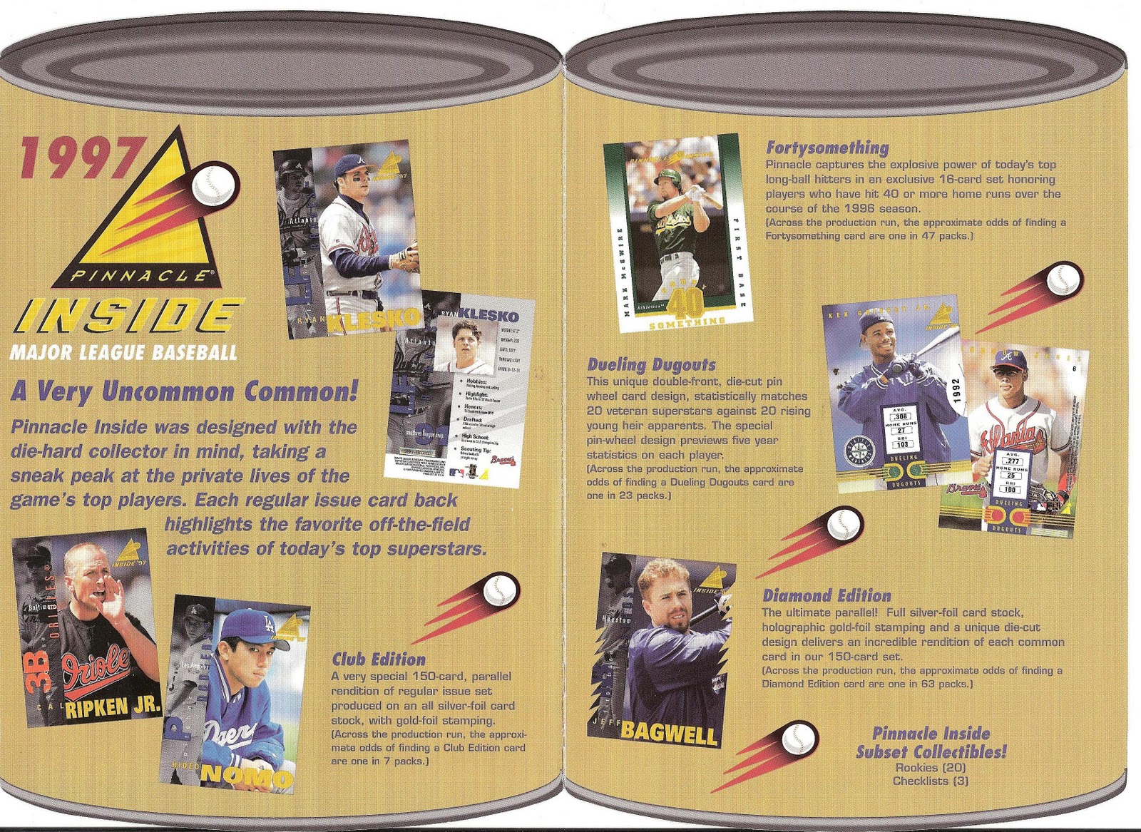
It was the day Pinnacle put cards in cans with Pinnacle Inside.

I know it may seem like untoward Pinnacle-bashing to subject a dead company to my rib-tickling scorn two weeks running, but you need to consider that 1) any company that puts baseball cards in cans has it coming and 2) I was part of the team that put the cards in cans to start with.

I can safely say from my padded cell inside my cozy little insurance company that I didn’t know what the hell I was doing. Neither, presumably, did any of the other members of the development team. In fact, I have no idea how cards in cans got past joke stage. I’m pretty sure no one on our team had the idea spring full-blown from their forehead, like Zeus birthing Athena. I don’t remember a product meeting where someone came out of the bathroom and said, “Hey, guys – let’s put cards in cans!” Meth on a stick I remember. But not cards in cans.

I’m guessing the way it happened is the way a lot of things happened in trading cards in those days. Once Upper Deck hit the scene, printers pretty much called the shots in the card business. If you were a printer and had a special technique for embedding diamond dust into football cards, Fleer was sure to be on line one and Pinnacle on line two. And Playoff was in the lobby, fishing around in its pockets for a dime.

Companies that owned their own printing plant had a leg up in this trading-card space race, unless they printed BP gushers of cards like Pro Set, or only printed in colors dogs could hear, like Upper Deck, or were so all-in on one funky technology that they couldn’t cope with anything else, like Action Packed and Sportflics.

I’ll bet my co-worker’s farm that the way cards in cans happened was that some printer simultaneously printing cans and cards messed up and accidentally put the cards in the cans.

It was one of those chocolate-and-peanut-butter moments where the guy with the cards and the guy with the can looked into each other’s eyes and said, “Let’s call Pinnacle!” And Pinnacle said to us, “Make it collectible, boys.”

Lord knows we tried. I mean, we had plenty to work with in an abstract sense, Gremlin-era butt-ugliness and Kim Jong Il autograph-model illogic notwithstanding. We had cans that could show the same image printed differently in varying levels of scarcity. We had a chase called "Duelling Dugouts," which I'm pretty sure I had nothing to do with. We had the most self-evident product name in trading-card history. And we had cards inside the cans that ranged from one-in-ones up to one-in-83s. The elements were easier to manipulate than a Republican Congress; as a collectiburger it had the Arch Deluxe beat eight ways to the golden M.

However, as noted card expert Junie B. Jones would say, yeah, but here’s the problem: It’s Dare to Tear all over again.

For the life of me, I don’t know how we could have let Pinnacle believe that destroying one collectible to save another was not the card-biz equivalent of invading Afghanistan with a dumptruck full of asphalt and a road roller.

Collectors have never, ever, ever seen the logic in destroying one thing to get at another. They don’t eat eggs for that very reason. They won’t even take a fingernail to their Kohl’s mailer to unleash their 15 percent discount. And I am dead-on certain that somewhere in this great Hole-Digging Mutant-Weasel State a collector is hoarding unused four-year-old lottery tickets because they might be valuable someday and, hey, the gold smears really make those cartoon billiard balls pop.

And furthermore, cans have never been a big part of the sports-collecting oeuvre. There are all kinds of soda cans from the ‘60s and ‘70s featuring athletes, and they’re about as collectible as a macramé kit. Why? They were never a part of anyone’s essential childhood memory package; they were just cans with guys’ pictures on them that were floating around for a little while. And I can tell you from personal experience that no one bought a can of Dr. Pepper because it had Carmen Fanzone’s picture on it.

So what you have with Pinnacle Inside really is an extremely tangible non-collectible with marginal collectibles sealed inside. And a company bankrolled by The Money Guys Who Brought You Enron not understanding why the heck these puppies aren’t flying off the shelves like brisket sammiches.

Oh, yeah, this too: We never gave people an easy way to get into the cans.

I can take my Olympia Beer “It’s the Water” can opener and punch a hole in the lid, but when I do baseball cards do not pour out. There is no opening tab, easy or otherwise, that grants you access to the golden succor waiting within. What I have to do to my can to get at the baseball cards inside my can is grind a clamp-and-twist can opener across the top, peel back the jagged metal, and resist the urge to scrape it across my wrist as I withdraw the cards.

Sure, I could cop out and use a Sawzall, but if you’re relentlessly old-school enough to collect baseball cards you’re not going to use an seven-horse power tool on the stinkin’ wrapper. You’re going to open it by hand, even if results in five stitches in your thumb.

(For the record, hand tools like crosscut saws, splitting mauls, or railroad spikes driven just below the lid with an eight-pound hammer also do the trick.)

Hard to believe, but I had forgotten about cards in cans until last week. Blocked it out of my memory entirely. But now that it’s back I am suddenly struck with a powerful urge to return to those halcyon days … of last week.

I know how to go make it happen, too. Just move the spike a little more to the left … a little more … just a touch … there. Now … SWING!

Ahhh. That's better.

Friday, July 23, 2010

Straw Dogs

Aw, to heck with it. I can't find this week's card. But here's the post anyway.


As I’ve mentioned several times on these electronic pages, when it comes to sports collectibles I have the world’s largest collection of worthless rarities. I am the person you call upon to fill out your Comic Ball 3 set, to score that elusive Pro Line Portraits autographed card of Aaron Cox, to hold in your hands the glory that is a Star Company Sam Horn set.

But what does that mean exactly? Does that mean I am the world’s greatest pure collector of sports memorabilia in the same unbearable, unlistenable way that Ornette Coleman was the world’s greatest pure musician, because I do not allow the joy of collecting to be sullied by the ogre of value?

I hope not. I wouldn’t wish that on BP. Besides, I have kids to put through college.

But to continue, grasshopper, what makes a worthless rarity outside of its lack of value, which is self-evident?

I guess to do that you need to know what makes a valuable rarity.

The valuable rarities I’ve seen have a couple of things going for them. First, they have a story. The Wagner card is the Wagner card in part because of the story, apocryphal or not, that it was pulled from circulation because Honus Wagner did not want his visage associated with tobacco products, Henry Reccius cigar cards notwithstanding.

Second, they need to be associated with a mainstream card set. There are baking issues and candy cards from the 1910s that are much rarer than the Honus Wagner card, but they’re also from obscure regional sets. It’s much more newsworthy when a T206 Honus Wagner showed up in a Maine farmhouse than when the aforementioned Reccius card appeared in a Louisville cigar box.

Then there’s star value and eye appeal, and after that is perhaps the most important thing: quantity. Having the only example of a collectible is not the road to the fortunes of Kubla Khan. Ideally you need somewhere between 10 and 25 examples of a collectible for it to be actively sought-after. Fewer than that and the known examples don’t show up frequently enough to keep the fervor bubbling along. More than that and the rarity deteriorates and takes the value along with it.

That’s why owners of one of 24 known valuable cards root with the fervor of a drunken Scottish soccer fan the existence of No. 25. They don’t want to spend $500,000 for a picture on cardboard and wake up one morning and discover it’s been replaced by a Kia Rio.

Here’s how this wickedness works. About 20 years ago an auction-house proprietor named Joshua Evans turned up what he claimed to be the most valuable card in existence: A U.S. Caramel card from 1932 showing Hall of Fame shortstop Freddie Lindstrom. The Lindstrom was the one card necessary to complete one of the toughest sets from the ‘30s and at that point was the only known example of that card.

This card has star value after a fashion, if you believe Lindstrom qualifies for Cooperstown on his accomplishments and not because Ted Williams got the Veterans’ Committee smashed on grain alcohol and Lithia water and what they wrote sure looks like “Lindstrom” from here.

It has a story. The Lindstrom card was withheld from circulation because kids who got a complete set of U.S. Caramel cards could redeem them for a baseball glove and U.S. Caramel wanted to keep the glove expenditures to a minimum. As in zero.

It wasn’t the best-looking card of the era, even before someone cancelled it. And while the U.S. Caramel set was national after a fashion, U.S. Caramel did not have the zillion slimy tentacles of the tobacco trust. So compared to the Wagner card the Lindstrom card was definitely minor-league.

But Joshua Evans laughs at such hindrances. He dubbed the Lindstrom card “The Million-Dollar Card” and took it on a barnstorming tour that made what C.C. Pyle did with Red Grange look like REO Speedwagon’s summer schedule.

And then he sold it. For less than a million. For less than $100,000 even. For around $90,000, if reports can be believed.

Again we ask, wha’ happen? The easy answer: not enough star power and too much scarcity. One card cannot make a market. Two cards, which is currently the number of known Lindstrom cards, cannot make a market, even if the owners of these cards, once they get them home, realize that $90,000 in the raw is far better-looking, even if it’s in pennies salvaged from automobile upholstery.

(Let this be a lesson to all those Fleer Flair and Stadium Club collectors waiting for the right moment to cash out their one-of-one Terry Puhl cards. Amen.)

So to bring things ‘round again, a worthless rarity has to lack star power, eye appeal, national scope, a marketable quantity, and a story. In short, it needs to be one of nothing.

Meet the 1989 Saranac Glove Darryl Strawberry card.

Let’s dispense with the story, such as it is. Green Bay-based Saranac Glove wanted to package a baseball card with its batting gloves and didn’t think a photo would properly showcase its product, so it commissioned Green Bay artist Dan Gardiner to paint Darryl Strawberry wearing a Metsish uniform and sporting Saranac gloves. It came off fine except for one thing: the Straw Man didn’t like his nose.

Now, Darryl Strawberry resembles nothing so much as a resident of the planet Zorg. For him to complain that they got his nose wrong is like Clint Eastwood complaining that they missed a wrinkle.

And it’s not like Gardiner missed Strawberry’s nose by much. Maybe he was thinking Darryl “Sausage Nose” Hamilton and painting Darryl Strawberry, but it’s close. And, hey, whatever happened to artist’s license?

Still, Saranac Glove would rather pull a perfectly good card off of the market than pay millions to a large-nosed, baseball-playing space alien. So the Saranac Glove card was history. Gardiner got a few, and the company ostensibly kept some, and the rest were destroyed.

Twenty years ago this would have been the perfect collectible storm: Hot player, legitimately scarce card, national distribution, not too ugly, interesting story. But between then and now Strawberry’s career came up short of Cooperstown, which in the card market meant he had the baseball career of a raisin. And no one pays extra for a picture on cardboard of a raisin, no matter how scarce.

So if you were looking for the quintessential worthless rarity, here's your answer. Though a Fleer Flair Terry Puhl sure looks like it qualifies from here.

Friday, July 9, 2010

Collect This? Read What?

People who were in the card business never got there through traditional, legitimate means. There was never any sort of internship-leading-to-post-graduate-study-leading-to-entry-level-job path all neatly laid out and codified in the employee handbook. It was hard to do in a business where the location of the restroom changed daily.

Instead, you had Harvard MBAs cheek-by-jowl with old journalists, venture capitalists, card-store owners, starry-eyed printers, diaper-division product managers, teenaged paper millionaires, and a sprinkling of paroled felons, for texture.

And the best part was, no one knew what the hell they were doing.

Soon enough, though, a couple of centers of activity emerged. There was the Philly-New York axis, home of the old money, such as it was – Fleer and Topps – plus newcomers like Classic and Major League Marketing. The area was also home to the infamous Renata Galasso shows, which were a sort of Woodstock for hairspray-fueled invective, and the iconic Cherry Hill show, held in a venue that made you exclaim, “Wow! I didn’t know Best Western did medium-security prisons!”

There was Chicago, home to puffy-card-maker Action Packed and the bought-up and relocated Leaf-Donruss. Leaf-Donruss was owned by the Finnish conglomerate Huhtamaki Oi, which is coincidentally what the Finns said when they saw Donruss’ balance sheet.

There was California, home to Upper Deck, and that was enough. If any more card makers had tried to settle out there Richard McWilliam would have pushed them into the sea.

There was Dallas, home to Pro Set and Pinnacle Brands and their bankruptcy lawyers.

And then there was Raleigh-Durham, home to Impel Marketing and SkyBox International, and later Maxx Racing, Inkworks, and the Racing Champions conglomerate.

The reason the card business stuck in Raleigh is pretty simple. Drive to downtown Durham, go past the gated community known as Duke University, park your car, whisper in its ear that you’ll see it in Heaven, and then sniff the air. It smells like an unsmoked cigarette.

The tobacco industry had spent millions building a distribution network aimed at having a pack of cancer sticks at the ready any time the impulse struck. It was no trick to pour a similarly addictive product through the same pipeline.

The first products through the pipe were NBA Hoops cards, which were tremendously innovative on several fronts. They were the first card set produced with the active involvement of a licensor – the NBA, obviously – which meant they were also the first card set produced with the active involvement of a midget. In that regard the David Stern set paved the way for … nothing, really, until the arrival of Zany Cards several years later. (Watch for the full Zany Cards story in a future installment.)

NBA Hoops were a seasonal item, but the nicotine taps were as wide-open and flowing as BP’s hole in the bottom of the sea. As a result, the NBA Hoops people – who were Impel Marketing at that time – needed more products to plug the pipeline.

Hence, Collect-A-Books.

If you weren’t a collector in 1990 this may not make sense. If you were a collector back then you have no business reading this, because one of the defining characteristics of collectors in the day was that they couldn’t read.

That’s not quite true, because I edited a card-collecting magazine that 100,000 people at a crack claimed to have read, though based on the letters I received, 79,000 just looked at the picture of the fat guy with the cards stuck to him. It was more that when it came to cards they didn’t care whether they read.

Companies like Pro Set spent vast sums compiling detailed player dossiers for their card backs, justifying the continued existence of Erik Affholter, only to find out that collectors liked a big ol’ glob of foil better. And Emmitt Smith on the front, if you please.

Collect-A-Books were the guy with the canoe, paddling against the current of this particular stream. While they didn’t bother to glorify Erik Affholter, they did carry far more reading material in their eight card-sized pages than most collectors deemed safe.

If you count words you'll discover that these cards were not exactly a pocket-sized War and Peace, delving into the crevasses of Ozzie Smith’s id. They carried as many words as your average Pro Set card (which incidentally was all out of go once it had one sentence down on Erik Affholter).

And lest collectors get too uneasy, Collect-A-Books also carried a whopping six pictures, including a snazzy caricature on the back cover.

Collect-A-Books were as well done as a trading-card sized player booklet could be, except no one bothered to ask beforehand whether anyone wanted a trading-card-sized player booklet.

Not to go all marketing on you, but that is a somewhat large question. I mean, there's always the possibility that it might be a bad idea, and that someone doesn't want a 30.06 that doubles as an mp3 player.

In the case of anyone wanting Collect-A-Books, the answer was no. A Hardee's Thickburger of a no. And it wouldn’t have mattered if the message had been delivered with the sensitivity of Sharon Osbourne showing the door to a prepubescent Taylor Swift impersonator on America’s Got Talent. The answer was still no.

You know, Topps, for all its what-the-hell approach to marketing, had this figured out years previous. It made insert sets and test issues of small paper comic books of top baseball and hockey players. They were very cool, even if they did drip a little cheddar. And card buyers said “ehh.” Give us a good rub-off (or rub-on or scratch-off or peel-‘n’-stick or something we can mutilate) any day.

If collectors weren’t going to clutch stone-free mini-comic-books of Reggie Jackson to their bosoms, they certainly weren’t going to nuzzle up to a pricey (approaching two bucks a pop, if memory serves) instruction manual on Ozzie Smith.

While Collect-A-Books were ostensibly created by a company called CMC they were run through the Impel pipeline, where they promptly clogged up the works and delayed the release of the latest paper-wrapped-death flavor for at least 10 minutes.

In the end, Collect-A-Books didn't put an eye out or explode when you ran over them or contribute to global warming, but you don't have to be Pol Pot to be despicable. What made Collect-A-Books nasty was that they were dumped on collectors by companies that frankly didn’t care whether they were unloading this stuff on George Plimpton and His Pals or a flock of seagulls. (The birds, not the band.)

Since this is a somewhat adolescent affair and adolescents always have to blame somebody, we'll blame Collect-A-Books on the diaper-division manager. But only because the teenaged paper millionaire was in a photo shoot with Russell Maryland and Brien Taylor.