Saturday, September 28, 2013

Extremely Dumb And Incredibly Stupid, Part II


You know I’m not a fan of racing cards. They take the loudest, fastest, rudest, most spectacular sport this side of hurling and make it look like Sunday in the park with George.


Lots of things marginalized racing cards, especially the trend towards larger sets. Mainly, though, racing cards were a victim of the very thing that made other sports cards better through the ‘80s and ‘90s, namely: better photographs.


As cameras and lenses and film and computer color-correction improved, the quality of action photography on trading cards blew up. I sat in photographers’ wells at major stadiums with trading-card shooters like Brad Newton and saw how they’d leave a camera with a telephoto lens the size of a Jack LaLanne juicer focused on second base. When there was a play at second they wouldn’t even look away from their main camera. They’d just reach over to the second-base camera and hit the shutter. They didn’t have to focus or put their eye to the viewfinder or anything. They’d have a perfect play-at-second-base photo frozen like Ted Williams’ head, and it was effortless.

The problem with this high-tech photography when it’s 
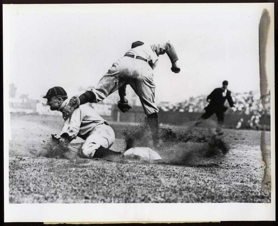
applied to racing is that every vestige of speed disappears. What makes Ty Cobb sliding into third the greatest baseball photo ever isn’t that every grain of dirt he kicks up is frozen stock-still; it’s that some dirt is just a blur. The photo makes Cobb look like he’s exploding into third, and that’s because the picture was shot using relatively primitive equipment and a relatively slow shutter speed.
That doesn’t happen with contemporary racing photography. Unless you’re shooting dirt-track racing – and no one was – a fast camera with a fast lens shooting fast film is going to make a car racing on asphalt look like it’s standing still – because that’s what it’s supposed to do.
Problem is, cars standing still ain’t racin’. Unless you’re Danica Patrick.
No one ever understood that about racing cards. For a short time we had Maxx Racing Cards as a client. Maxx was located in Mooresville, N.C., a holler and a half from Charlotte and smack-dab in the middle of NASCAR country. Those boys knew racin’ with a capital apostrophe – so naturally, they wanted to do draft-pick cards.
We sat with them in the posh dining room of the Mooresville Country Club, complemented the proprietor on the genuine knotty-pine paneling they’d picked up at Lowe’s, drank sweet tea, and talked trading cards. Never did the Maxx boys acknowledge that one of the major failings of racing cards was they didn’t show racing.
It wasn’t just photography stringing up the Dukes of Mooresville. Thanks to NASCAR’s all-seeing eye, cards of crashes were out, and so were cards of the Busch brothers giving each other the finger. All Maxx had to work with were cards of cars standing still, cards of drivers wearing mirror shades, cards of crew members reading newspapers, and cards of trailers.
Companies like Maxx and Action Packed that did racing well could make something reasonably compelling out of that. It was the amateurs that brought racing cards’ shortcomings into focus.
A& S Racing Collectables (sic) made cards of Indy-car racing, a type of racing that’s better in every tangible way than NASCAR – faster, louder, more dramatic – yet still manages to be an inferior product. (That takes work, let me tell you.)
That inferiority carries over to the 1985-vintage C/DA-PPG set. It’s the Indy-car racing of racing-card sets, and this Derek Daly card represents the absolute nadir of racing carddom – a crummy, static picture of a mediocre driver (12th at Indy, but didn’t race at Michigan or Pocono, and was sitting at 39th in the Indy-car standings at the time these were printed), on flimsy cardstock festooned with homemade graphics and the letter “W” placed on the card front for no apparent reason.
If you’re looking for a reason why SkyBox, Action Packed, Pinnacle, Maxx, Traks, Pro Set, Press Pass, Finish Line, Upper Deck, Fleer, and Racing Champions made NASCAR cards, and none of them wanted in on Indy-car racing, here’s your reason. They saw this card.
Hard to drive with blood on your hands, eh, Derek?


Many columns ago we explained how Pro Set’s Young Indiana Jones set was not the victim of a whack print job. Au contraire, Eau Claire: Pro Set meant to do this. The cards are 3-D, and here’s the viewer put in every pack to make the cards look normal (or as normal as anything can look when viewed through red and blue cellophane).
I have a problem with the larger concept of 3-D, especially as it’s applied to movies (The Great Gatsby in 3-D? Really? What’s next? Wuthering Heights in 3-D? Finnegan’s Wake with flying pronouns? Macbeth 3-D?), but I’m semi-okay with the 3-D glasses-things. Still, what does it say about your set if you have to put a device in every pack to keep the product from looking defective?


Smaller card manufacturers in the Handful O’Landfill era lived from license to license. If the movie or comic book or TV series hit (Buffy The Vampire Slayer, Evil Ernie/Lady Death) the card company ate steak. If it didn’t (Pagemaster, Dinotopia) it ate hot dogs.
If you imagine smaller manufacturers playing The Game of Life, their path to wealth and happiness was the long one. The really long one. The one that went off the board and twice around the coffee table, down the stairs, over the dog, in and out of the hutch, and through the breakfast nook. If a couple of peg children fell out in the process, so be it. Life’s tough when you’re a small cardmaker in a plastic car.
It’s a 1930s M-G-M-musical approach to business, with the aspiring starlet crushing it in the high-school musical while a Hollywood producer just happens to be sitting in the audience, and it would have worked if these companies hadn’t had such a tin ear for licenses. Lime Rock went from Mad magazine cards to NBA cheerleader cards to muscle-car cards to draft-pick sets to Desert Storm cards to cards of Starlog magazine covers and Bozo the Clown. Little Sun careened from Major League Writers to high-school baseball all-stars to Wooden Award winners. Collect-A-Card bounced from Coca-Cola to Campbell’s Soup to Dinotopia. But no one was less skilled at riding winners than Kayo.
Kayo started with a demi-successful boxing-card set, and when that grubstake was overrun by Ringlords and others swiftly locked down the license for the Professional Spring Football League. When the PSFL turned out to be as substantial as a Miley Cyrus B-side, Kayo swooped in and picked up the license for the National Skateboard Association.
Yeah, I didn’t know it existed, either, but here’s your proof: A Chris Miller prototype card (and not the Chris Miller of the multiple concussions and unfulfilled NFL promise, though I can totally understand why someone with a history of head injuries would consider a pro-skateboarding career), replete with the claim that “Chris enjoys surfing and artsy stuff.”
(What? Surfing's not artsy?)


Okay, but the thing is Kayo was probably thrilled to get the National Skateboard Association license, because it probably had competition.
The Kayo Kidz were not on an island here. No no no no no no no no no. They undoubtedly had to beat back Little Sun and Lime Rock with their PSFL contract to bring home this puppy. And after they got it I'm sure they celebrated. Went and looked at artsy stuff or something.
Kayo had the best mascot in trading cards – a kangaroo, shown here riding a skateboard[1] – but having the best mascot in trading cards is like having the longest toenails in Major League Soccer. It’s a whole lot better to have something that makes money.
On the other hand, if you had a marginal property like Prancercise and wanted a trading-card set, it was always nice to have a number to call or a booth to visit at the licensing show and hear an eager voice say, “Prancercise cards? You bet!”

The call from reality could wait.


[1] Not that it had a lot of competition. Bazooka Joe doesn’t count. Neither does Lud Denny.

Friday, September 20, 2013

Extremely Dumb And Incredibly Stupid

As I wrap up my current job and prepare for a new challenge, it's time to clean up some odds and ends I've had laying around my office and environs.


When I was editing coin magazines in Iola – no, wait; let me back up and mention how I wound up editing coin magazines in Iola.

I had been working for an ad agency in Wausau, Wis., that one day decided, Baltimore Colts-style, to move 200 miles south to Milwaukee and not tell me. I came to work one day and there was a sign on the door reading, “Moved to Milwaukee. Sorry.” Moved to Milwaukee? Really? After I created “The Wausau Center Mall Polka”[1] just for them? That’s gratitude.
After the unemployment ran out I was like Alexander the Great, weeping because there were no more worlds to conquer, advertising-wise. I really wanted to work for Krause Publications in Iola, Wis., because KP was local and did magazines about baseball cards. So I pestered the heck out of the HR guy until I got an interview for an editorial-assistant position on World Coin News – not Baseball Cards magazine by any stretch, but the proverbial foot in the door.
During the interview, and sometime before he told me the starting salary was 14[2], the HR guy asked me, “Do you collect coins?”
“Of course,” I said. I didn’t tell him my coin collection consisted of a half-full penny folder and a Band-Aid box full of dinged-up silver dollars, worn-flat Liberty quarters, Canadian beaver-back nickels, and a couple of bus tokens worth a total of $17.50.
That was the clincher. I was officially on the staff of World Coin News, and not too many months later, when the editor received a higher calling, I was named editor of World Coin News.

It was a position of not insignificant prestige in the numismatic community, because it attracted weirdos like Mountain Dew attracts hornets.

My favorite was The Mighty Shane Vickers. I’m guessing that was his full name, like Neil Patrick Harris, because whenever he wrote he never called himself anything other than The Mighty Shane Vickers.
Anyway, The (as I was fond of calling him in those days) once wrote me and demanded that his face be put on a coin emblazoned with the legend “I AM THE MIGHTY SHANE VICKERS,” and the coin shown throughout the national nightly news broadcasts of ABC, CBS, and NBC.
I don’t know what he thought I could do about it, and I don’t remember what terrible calamity he promised if his request was not carried out. It may have been something like, “Grant my wish or I will star in a Wonderful Pistachios ad.”

Naturally, we turned over The Mighty Shane Vickers to the authorities, who later made him Secretary of the Interior under George W. Bush.

The point of this autobiographical rambling is that The Mighty Shane Vickers was the victim of bad timing. If he could have waited another 10 years and learned to hit left-handed he could have had his face on a coin, and he wouldn’t have had to enlist some schlubby $14,000-a-year man to make it happen. Pinnacle would have done it for him. He still wouldn’t have been any closer to Peter Jennings, though.


I haven’t been to the National Sports Collectors Convention in more than 15 years, but I’m guessing that a card company still sponsors the exhibitor badges.
I look at this one and see two things: a stable of great SkyBox brands driven into the ground by the phine pholks at Phleer in Philly, and Tom Goodwin.

I’m not sure what message is being sent by putting Tom Goodwin on my exhibitor’s badge. It either means I’m extremely good at being extremely fast, or that I’m a one-time hot prospect reduced to being a one-dimensional role player most skilled at riding the pine.
I’m going with the first explanation, though the second one is certainly in play.


There’s a genre of cards from the ‘30s that show pulpy art of pulpy subjects. The most famous of these sets, G-Men and Horrors of War, look like grade-school comic-book pictures of Chinese babies having their heads blown off, printed on the inside of a cereal box and cut out with scissors. If Topps put Lamb of God in charge of its non-sport division and hired Shane McGowan to do quality control, this is the outcome you’d expect.
The guess is that Dart Flipcards was striving for that look with its Vietnam War set, but made the mistake of opting for quality and restraint over death-metal bands and toothless drunkards. The white cardstock (not a good thing in this case) shows every detail of the overly sketchy artwork (not a good thing, volume two). The card copy is bilingual but Canadian-polite in both languages (not a good thing/pas une bonne chose). The overall look is distinctive but not good-distinctive. More like homemade-distinctive.
No one wants to open a pack of cards and see a crude rendition of a burning child running naked down a Vietnamese road, unless that’s what the subject matter demands. The Rape of Nanking was a brutal, despicable act that demanded a brutal, borderline-despicable card. Similarly, the crime-doesn't-pay message had to be hammered home in the '30s, because there was a growing body of evidence that crime paid a whole lot better than unemployment.
Dart opted to come down on the side of tact. The result isn't bad; it's merely wrong.

More from the going-away (you wish) files next time.


[1] Truly a fine piece of creative work, if I say so myself. Wausau was making a Great Leap Forward with the construction of a downtown mall, and the city had hired our advertising agency to do the creative. One day my boss walked into our spacious-yet-dingy office above the King’s Knight discotheque in west-central Wausau (or WesCen, as all the cool folks called it) and said, “We need a mall jingle.” I went home and with my guitar and keyboard created a paean to the revolutionary shopping experience that was the Wausau Center Mall, and set it to the tune of “The Laughing Polka.” (Don’t ask me why I knew “The Laughing Polka.” If you spent any time in central Wisconsin in the ‘70s and ‘80s, you knew polkas.) I can remember one of the verses went,  “Oh when I was a little boy so many years ago/I used to love my shopping, and shopping wasn’t slow/But now I have a place to go that’s just like way back when/I shop the Wausau Center Mall, where shopping’s fun again,” and was followed by a chorus of, “Oh ha ha ha ha ha ha ha ha ha ha ha ha ha ha ha ha ha ha ha ha ha ha ha ha ha” etc. (They didn’t call it “The Laughing Polka” for nothing.) With this piece of sterling songcraft in hand I went back to work, walked into my boss’ office, and said, “I’ve got it – the perfect jingle. It fits the demographic, it works in the slogan, and it’s catchy.” Then I played her the jingle. It probably took them a week after that to get everything packed up and moved to Milwaukee.


[2] Thousand dollars a year, not dollars an hour. That distinction tripped up my buddy Phil LaFranka, who wound up taking a pay cut to come to KP, but I always thought the HR guy was not entirely to blame in Phil’s case. There’s no way Phil could have driven into Iola, Wis., population 925, past the millpond and the JBJ Store and the abandoned pickle factory and say, “Yeah, there’s a place here that’s gonna pay me 14 dollars an hour to strip ads into shoppers.”

Wednesday, September 11, 2013

Derek Jeter And The Perversey Jersey

Ah, the remembrance of things past that I can’t show you, not that I would want to.
For instance, one semi-prospective client wanted us to promote their book, Arnold Palmer and the Golfin’ Dolphin. It was a legitimate book in that it had covers and pages and an assortment of nice words and illustrations after a fashion, and it ostensibly had Arnold Palmer’s permission, because him suing them was not the reason they went out of business. No, the reason they went out of business was that as a work of existentialist children’s fiction involving the world’s most highly evolved mammal and a golf legend, it stunk. It was the Watch The Throne of dolphin-golfer children’s-fiction mashups, and still it blew huge literature chunks.
As a sometime children’s author and songwriter, I understand the seductiveness of the golfin’/dolphin rhyme. It took the influence of an Indian holy man to keep Lennon and McCartney from going completely golfin’/dolphin crazy. One can only imagine the different path “Let It Be” would have trod had the two lads not restrained themselves. (Fortunately, I have no such restraint issues: “When I find myself in trouble golfin’/Arnold Palmer comes to me/He says, ‘Ignore the dolphin/It’s a par-three.’”)
I can’t show you the book, because my partner Dean and I found it in the course of cleaning out our offices, dropped it on the doorstep of the nearest elementary school, rang the doorbell, and ran. So I’m guessing it’s somewhere in the greater New London school system, where it’s probably celebrated as art.
Let us move from Arnold Palmer and the Golfin’ Dolphin to the leather mini-replica-jersey equivalent of Arnold Palmer and the Golfin’ Dolphin. I thought I knew everything that went down during the Handful O’Landfill era, card-wise; I even knew of the Classic Winnebagos set, though I pretended not to, and in fact went into the kitchen for a drink every time they entered the room. I especially thought I knew everything that a major manufacturer had ever thought of, including NBA Hoops folders and Donruss Red Zone football, the John Carter[1] of football CCGs. But I had never, ever heard of Topps Jersey Topps until I saw the press release.
You know you’re in for a spin in the dunk tank when you see the name: Topps Jersey Topps. It’s a palindrome. No, no, not a palindrome. It’s that thing where it sounds the same backwards and forwards. A pun – that’s it! A pun. No, it’s not a pun.
See what Topps Jersey Topps did? It made me screw up the Dead Parrot Sketch.
No other manufacturer felt compelled to work its name into a product this way. There was no SkyBox Basketball SkyBox set, no Pro Set Football Pro Set, no Fleer Baseball Fleer, though Fleer Flair came a little too close for comfort. Only Topps felt the second Topps was necessary, though pretty much by definition a jersey is, you know, a top.
As alluded to earlier, Topps Jersey Topps (I can’t get used to the name; it reminds me too much of Canadian postage stamps) is a set of miniature leather replica jerseys.
That word combination seems random, so let’s break it down.
The jerseys are miniature because you can’t J-hook a Mark McGwire uni in the notions aisle of a Kum ‘n’ Go.
They’re replicas (I’m saving the leather for later) because the MSRP on even a Sammy Sosa game-worn is liable to be out of the financial reach of the Kum ‘n’ Go night manager who is the demographic target of this particular set.
They’re jerseys because stirrup socks aren’t sexy enough, at least not on Cal Ripken Jr.
And they’re leather because … because. Because cloth is too downscale. Because Topps confused a set of baseball cards with a Bentley Flying Spur.
Well, let’s go to the press release. Maybe it has some guidance.
Here we are: “Each Jersey is designed to simulate the feel of cloth and crafted from genuine flexible leather, rather than a hard, molded plastic.”
That’s it. Make the jerseys out of leather to simulate cloth because it’s easier to make leather feel like cloth as opposed to plastic.
While this happens to be true, it’s also meaningless. Of course leather is a more cloth-like material than plastic. It’s also a more cloth-like material than lead or molybdenum. And let’s deal with the elephant in the room right now: the most cloth-like material of all is cloth.
Later in the press release we find, “Each one is also painted to scaled specifications of the original, authentic jersey and includes all team logos and player names.”
Again we say: that’s it. Paint the leather jersey instead of screen-printing a cloth one – or better yet, making it out of wool and shrinking it like a Tom and Jerry zoot suit.
As for the raison d’etre of this particular product, Topps must have suspected there would be questions, because it came prepared with an answer: “Fans and collectors now have the perfect item to attain autographs.”
Not even dealing with the fact that it’s way easier to obtain an autograph than attain one, if I were an official league baseball or an 8x10 glossy, I would be royally pissed right now. In fact, I’d be hiring a game-used home plate to ram Topps Jersey Topps’ teeth down its palindromic throat.
The best thing about Topps Jersey Topps is not the price, though we all can agree that $9.99 is a small price to pay for painted leather meant to feel like cloth, the perfect item to attain autographs. Nope, the best thing about Topps Jersey Topps is there are only six of them in the set (I can’t believe you want to know this, but anyway: McGwire, Sosa, Ripken, Chipper Jones, Ken Griffey Jr., and Derek Jeter).
While I’m sure there are other HOL-era collectibles from the major manufacturers that I’ve missed, I don’t know whether anything else will offer the combination of ham-handed concept and bone-headed execution to match Topps Jersey Topps.
Though I’m guessing the golfin’ dolphin folks would be up to the challenge.


[1] Or Ishtar or The Postman or Waterworld or Heaven’s Gate or the last decade-and-a-half of Adam Sandler movies.